Basic Maths
is a theme
for WordPress
It was designed and developed
by Khoi Vinh of Subtraction.com with Allan Cole of fthrwght.com
Beautifully Designed
Simply the best looking, most elegant, and smartest designed blog theme available anywhere. If you want to make a statement about how important your content is, Basic Maths is the answer.
View
Color- Scheme Control
Change up Basic Maths’ minimalist color scheme in a matter of seconds to any color you please!
View
Video Friendly
New CSS rules make it easier than ever to embed video right into your posts.
View
Grid- tastic!
Every template is based on a rational, methodical typographic grid for impeccable layout guidance. Just hit SHIFT + ALT + G to see it on any page!
View
Now Works Great with
WP 3.0
You asked for it: new and up-to-date, easier menu management, and a new custom logo setting.
View
Magically
Formatted
for iPhone
Basic Maths presents all of your posts in a streamlined, iPhone-ready format, perfect for on-the-go reading. All you have to do is — nothing!
View
Share
Improvements
- iPhone optimized Markup and CSS.
- Styling for embedded Video.
- Styling for misc. content with .hang-1-column & .hang-2-column classes.
- Custom Header Logo option.
- Conditional widget areas which allows for ‘empty’ sidebars if no widgets are added.
- Conditional “Continue Reading” and Prev/Next links.
- WordPress post classes to post divs.
- Highlighted Authors comments.
- Advanced Child Theme support.
Requirements
- Requires a standalone installation of WordPress 3.0 or higher.
- FTP access to your own server and basic working knowledge of WordPress configuration.
- A separate version of Basic Maths is available for WordPress.com users. Click here for more information.
- Please read the documentation for more information.
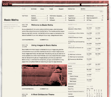
Beautifully Designed
An extraordinary amount of care and attention went into making Basic Maths the most attractive — and usable! — theme around. Now you can even add your own logo to the top of the page with an easy theme option!
Color-Scheme Control
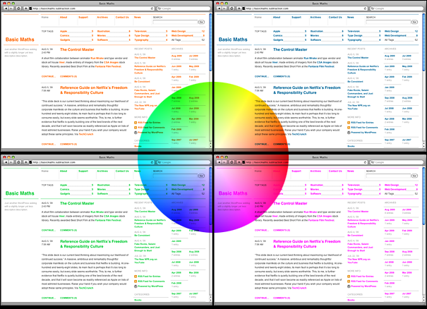
A theme option allows you to specify and apply your own colors with a single click.
New CSS rules make it easier than ever to embed video right into your posts.
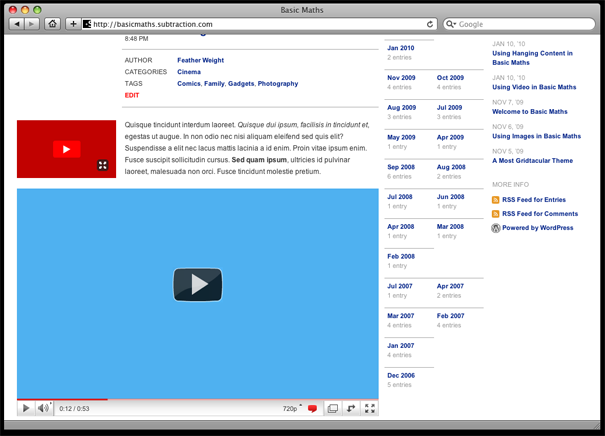
Users demanded it so this latest version of Basic Maths makes it simple to seamlessly add videos from YouTube, Vimeo and other services.
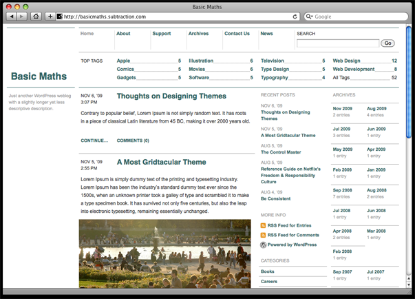
Grid-tastic!
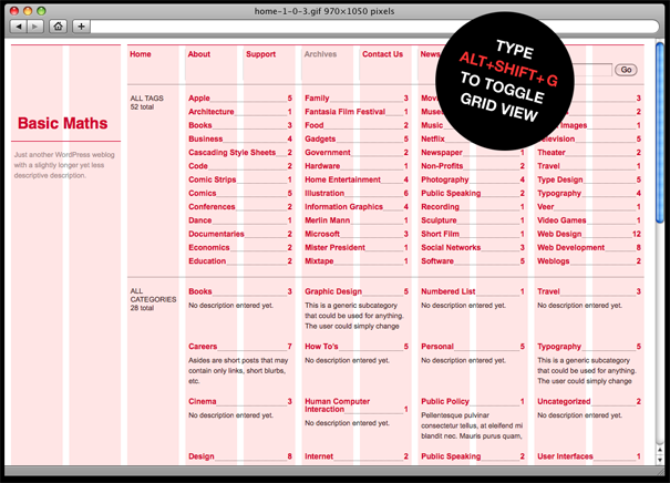
Basic Maths is based on the landmark design of Khoi's own Subtraction.com, so you can rest assured that it’s the most thoughtful and well constructed grid theme you'll find anywhere.
Now Optimized for WordPress 3.0
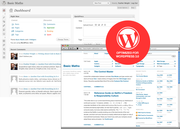
We’ve updated Basic Maths to take advantage of custom menus and new, more powerful editing made possible by WordPress 3.0+. Plus, you can now easily add your own custom logo! Version 1.1 is backwards compatible with older versions too.
Magically Formatted for iPhone
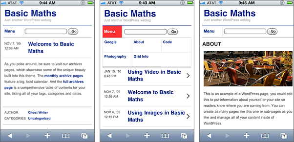
The world is going mobile and Basic Maths helps your blog go mobile too! All of your posts show up in compact but elegant — and very easy to read — form on the iPhone.